
Work in progress.
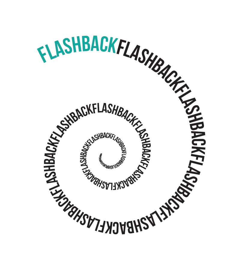
Identity for a new TV format, an infotainment show with a concept that is yet to be revealed to the public.
So, pssst.
However, I really like how a seemingly simple typographic intervention can have such a profound effect on the perception of a logo.

