
Teaching bot dogs some new tricks
VISUAL, UI, UX DESIGN / ANIMATION / CREATIVE & ART DIRECTION / COPYWRITING
Being experienced in designing for autonomous mobile robots such as SoftBank Robotics’ Whiz, Project Auto-C, and Project Auto-D for Walmart, I was excited when I got a chance to expand on that.
It felt great to go beyond the industrial applications and design for an AI-powered robot capable of evolving and learning.
But, consumer robotics is hard. You see, the main rule in industrial robotics is described by the 3Ds neologism - robots are used if the work is Dull, Dirty, and/or Dangerous. Simple.
However, consumer robotics has an entirely different set of rules (oh, and it breaks and changes them all the time, trying to get some traction). And, unlike its industrial sibling, it is still in a nascent stage.
So, designing an app that controls such a robot was a unique challenge.
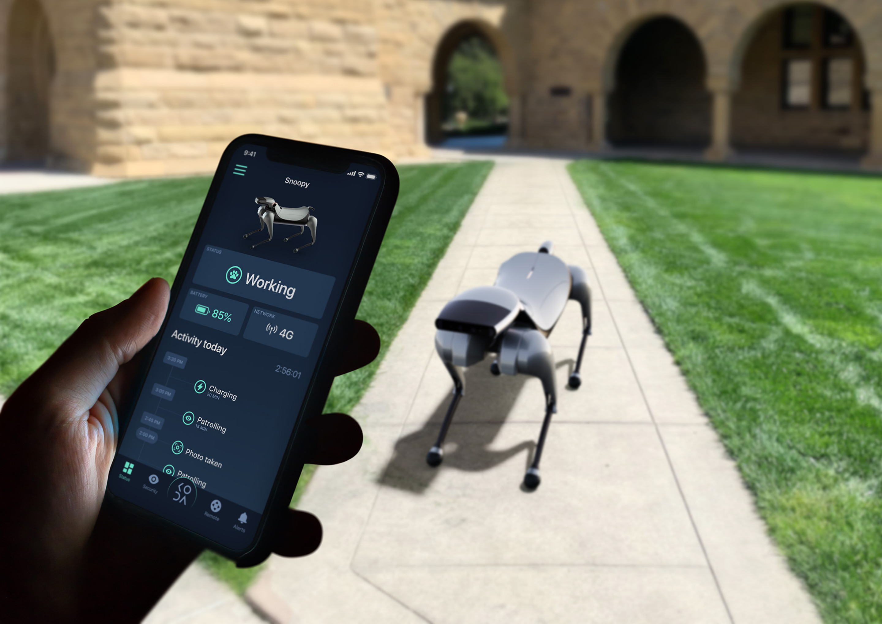
This dashboard screen displays an overview of all vital statistics and metrics for the robot. In addition to the current status and health, battery, and network info it provides a complete list of the robot’s activities in the past 24 hours, a total active time, and all the alerts and important events that the robot has recorded.
Size does matter
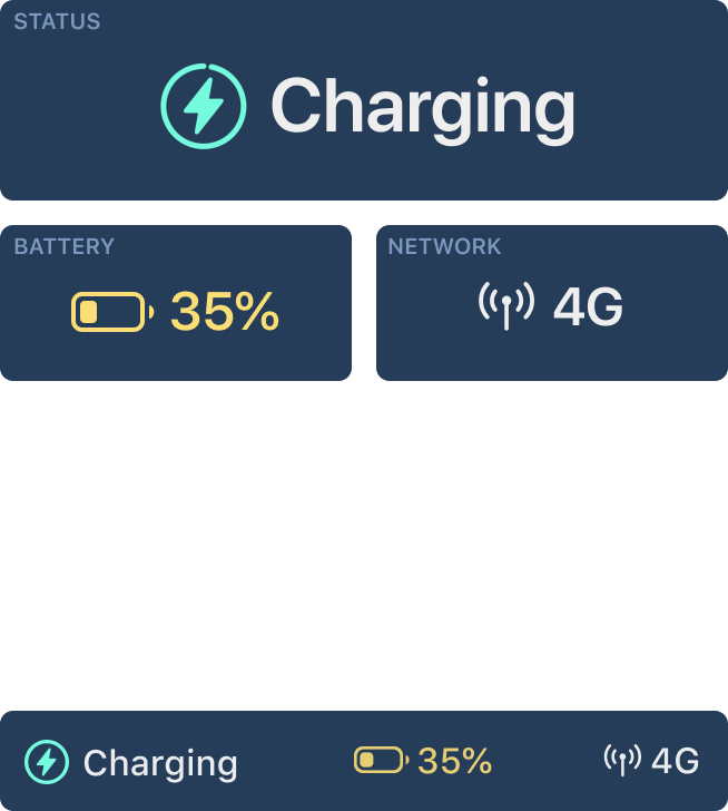
To ensure a legible view of the activities, robot view, status, battery, and network info are minimized on scroll, giving more screen space to the Activity list (a jump from 34% to 70% of the total available screen height).
Establishing Bluetooth connection
Voice recognition setup
Face detection setup
Setting up
AI is thinking
In progress
Facial recognition
Voice recognition
Searching
For the Remote control view, the main challenge was to design the UI with all the necessary controls and functions (dog movement, head movement, sound on/off, intercom mode, video recording, photo camera, speed control, emergency stop, and navigation mode buttons) and still retain the unobstructed and usable dog POV.
Watch where you’re going
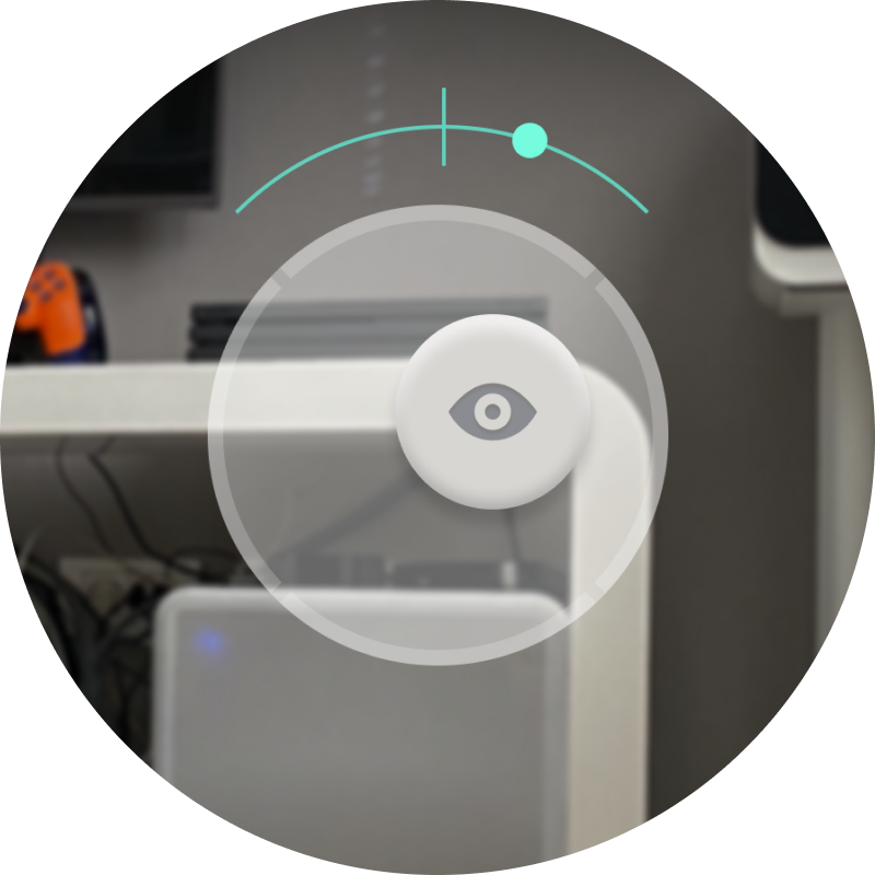
Early on, I realized that, because the controls for the body and head/camera movement are independent, the user can’t know if the robot is looking straight ahead or not while in the Remote control mode. Once the user releases the controller, the head does not return to the neutral position automatically.
That can cause problems and even possible collisions while navigating.
A simple way I came up with to mitigate that is by introducing the horizontal axis head position indicator™ (that’s a mouthful) - it works very intuitively and gives the user an immediate understanding of the head/camera position.
The challenge here was to design an unobtrusive but comprehensive menu to control the dog’s behavior and emotions, as well as an option that allows the user to choose from a list of locations for the robot to patrol.
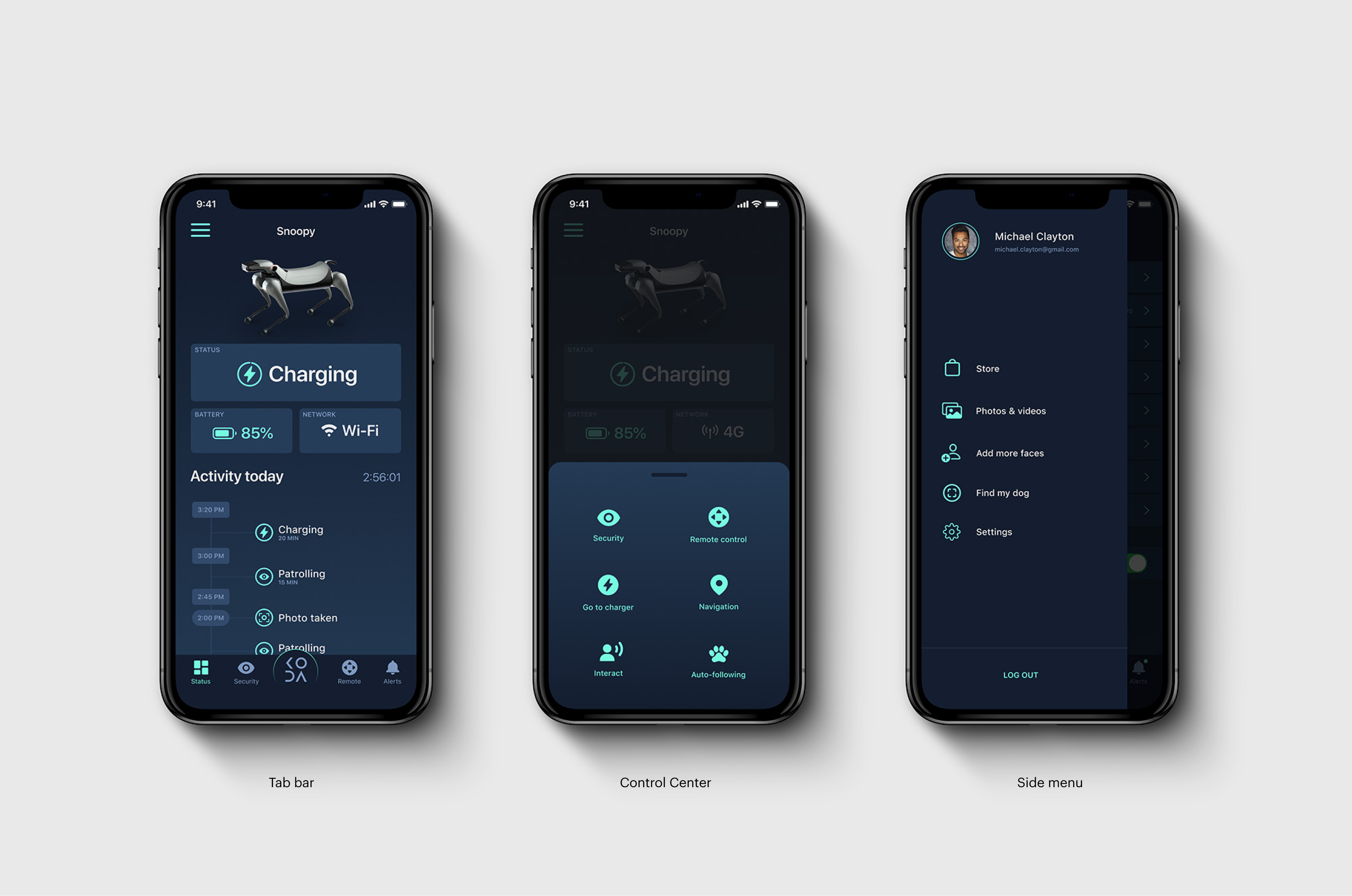
A cool little feature - dog and head/camera movement controllers are flippable so the interface is ergonomically accessible and easy to use for left-handed people as well.
