
IS IT A TO DO? IS IT A CALENDAR? YES.
VISUAL, UI, UX DESIGN / CREATIVE & ART DIRECTION
A personal project.
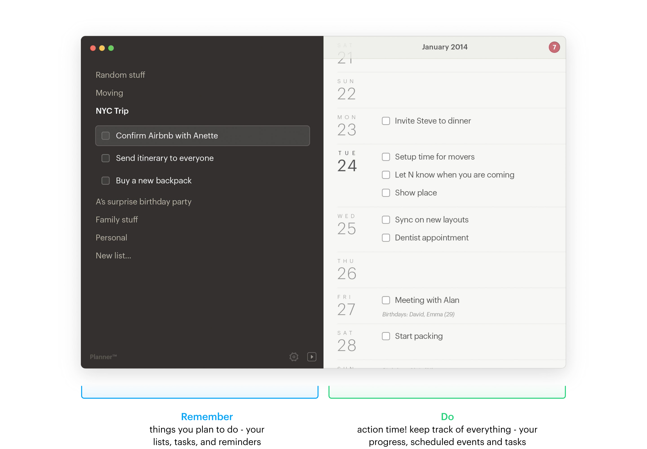
A hybrid tool that combines a to-do and a calendar in one app, mixing the best of both worlds into a glorious package of anti-procrastination task-completing mastery.
Bringing the analog substance to the digital form.
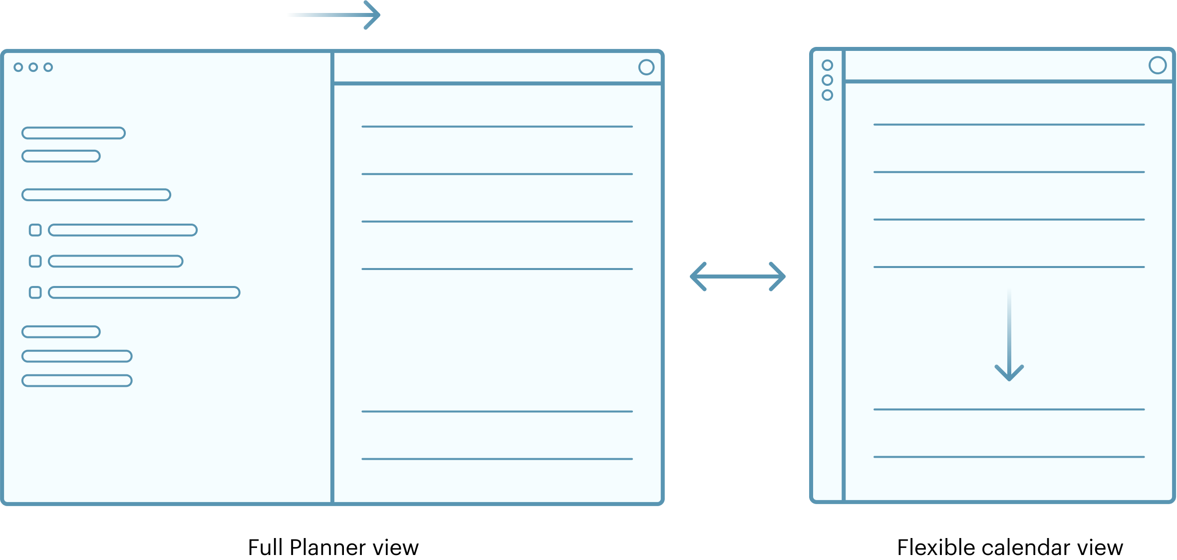
Inspired by an old Moleskine planner, the interface is divided into two pages - lists and calendar.
Anytime you want to schedule an event, drag it to the calendar. Try doing that with a Moleskine.

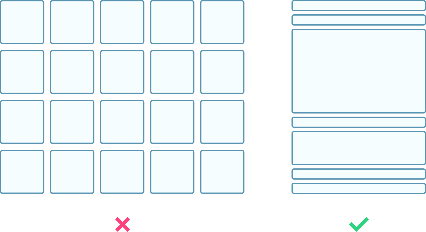
The more events you schedule, the longer your day gets (both metaphorically and visually).
No events? No space wasted.

With the classic calendars, you are forced to squeeze all the things into the rigid, predefined space. Here, the more you add the more the day expands. This fluid behavior helps you focus on the important stuff and eliminates empty days that just take up space.

Want to transform a task into an event?
It's easy - just drag it to the calendar and drop it.
Or move it back. No big deal.