IT PAYS TO LISTEN.
BRANDING, CREATIVE & ART DIRECTION

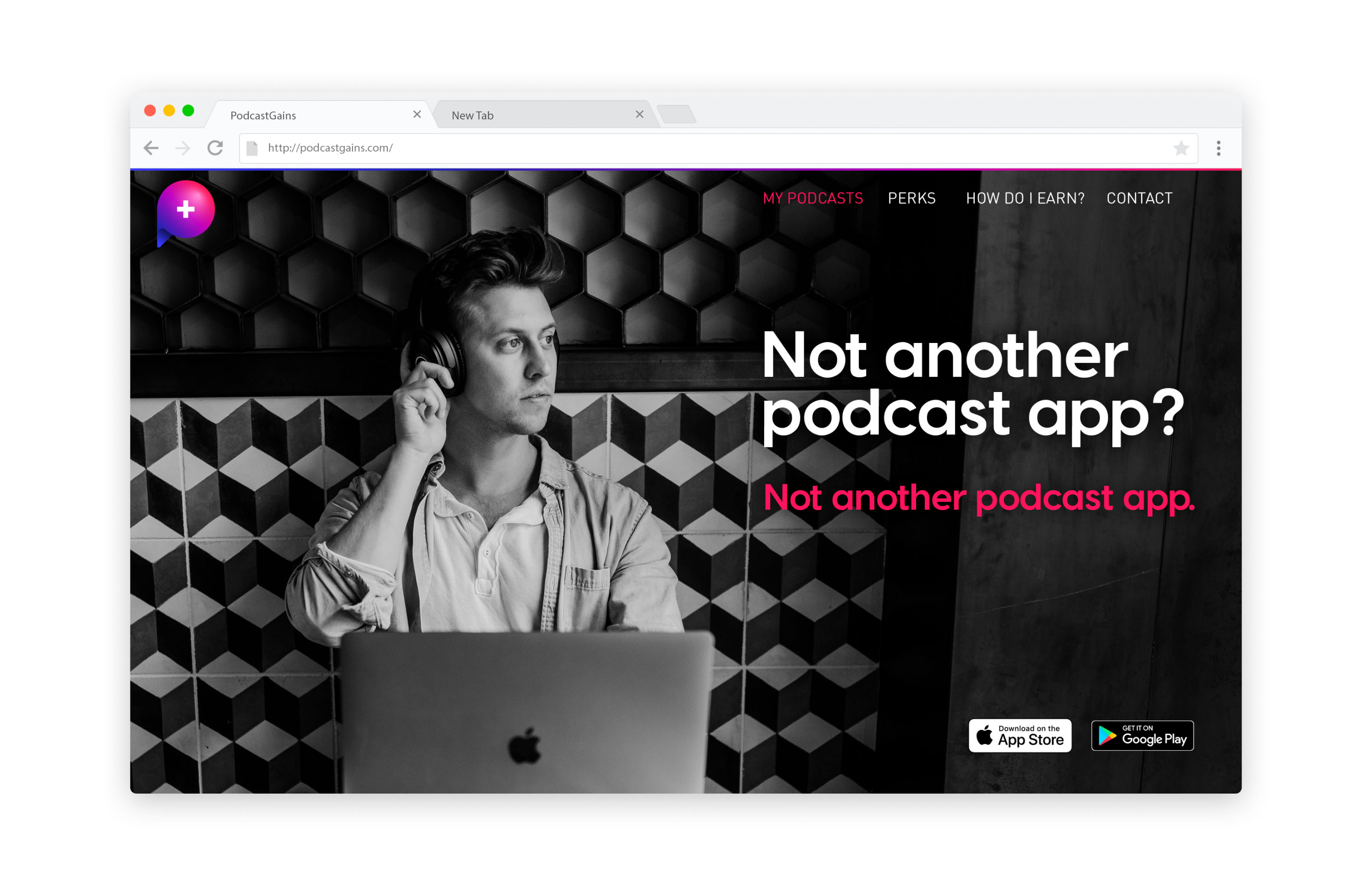
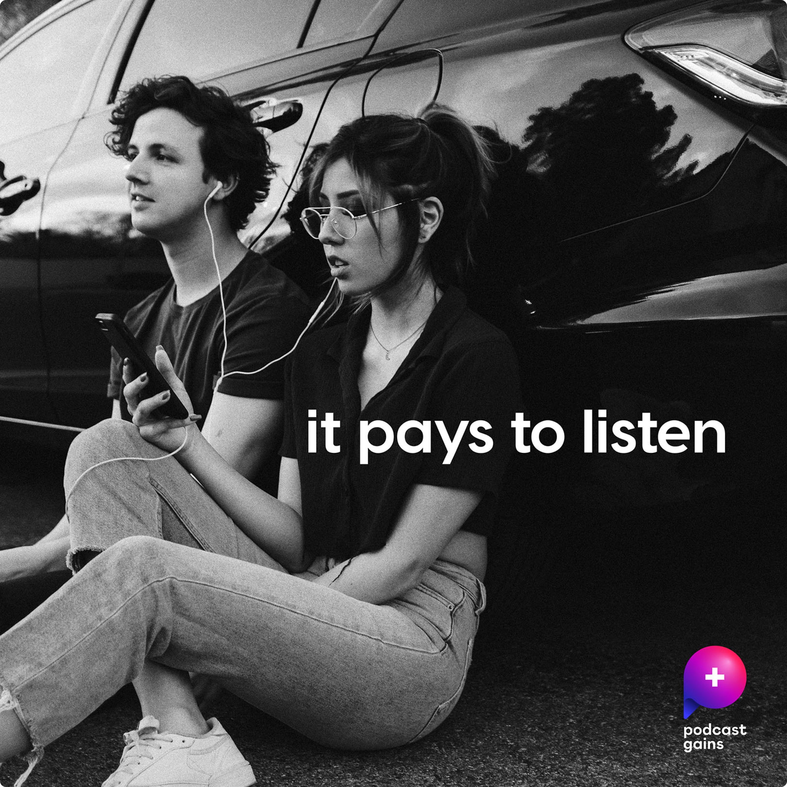
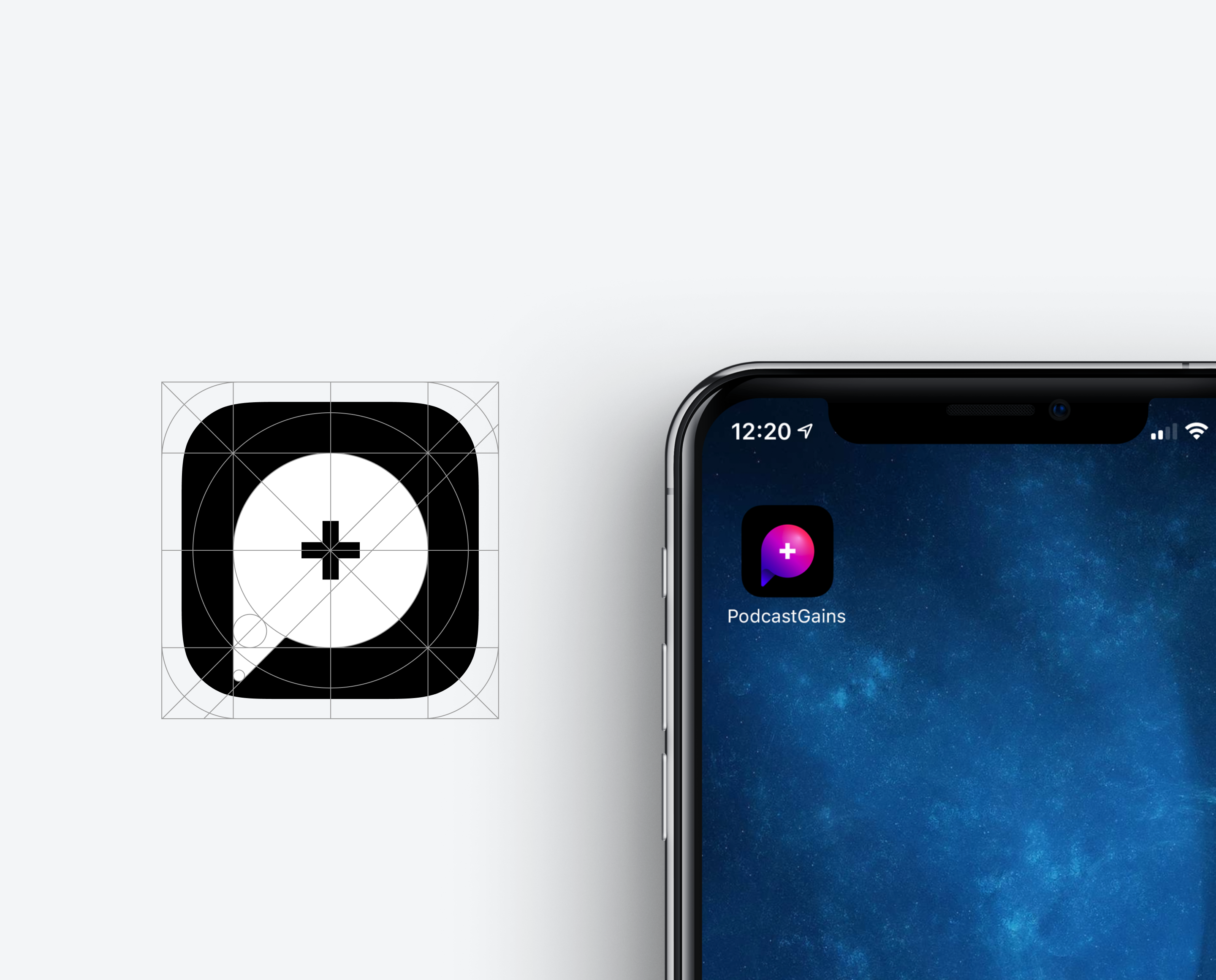
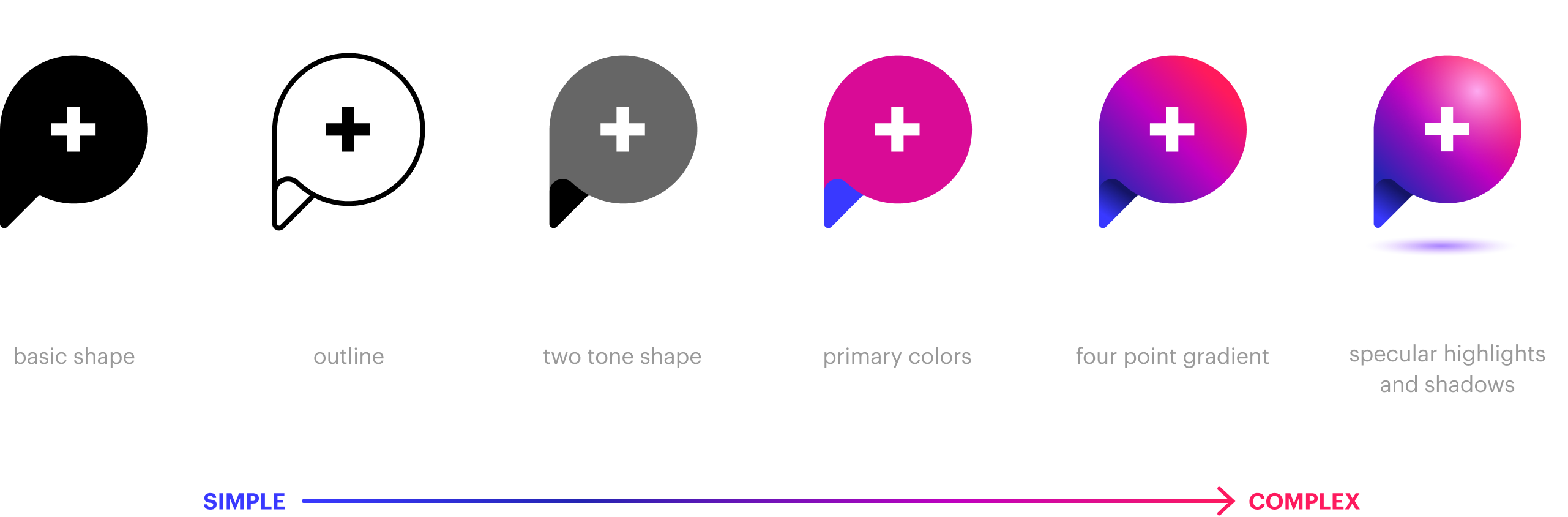
I defined a way to allow the logo shape to be used as a virtual window into a cool and exciting world of listening to podcasts while earning rewards.
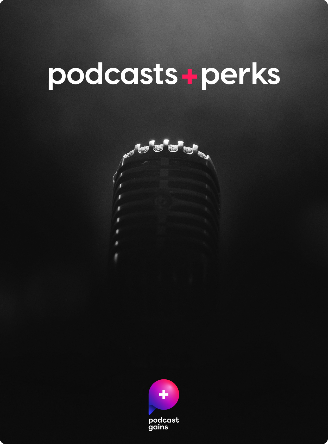
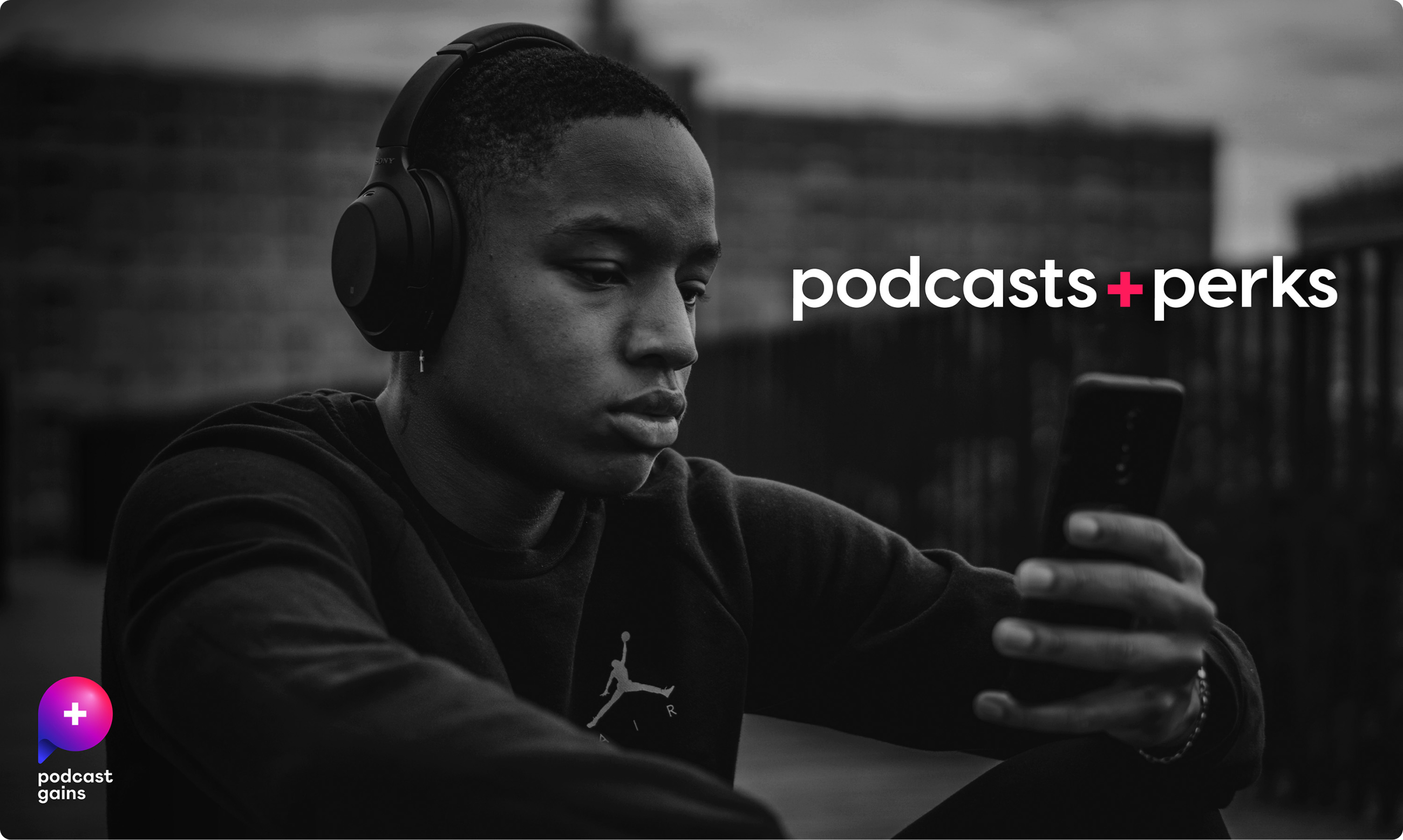
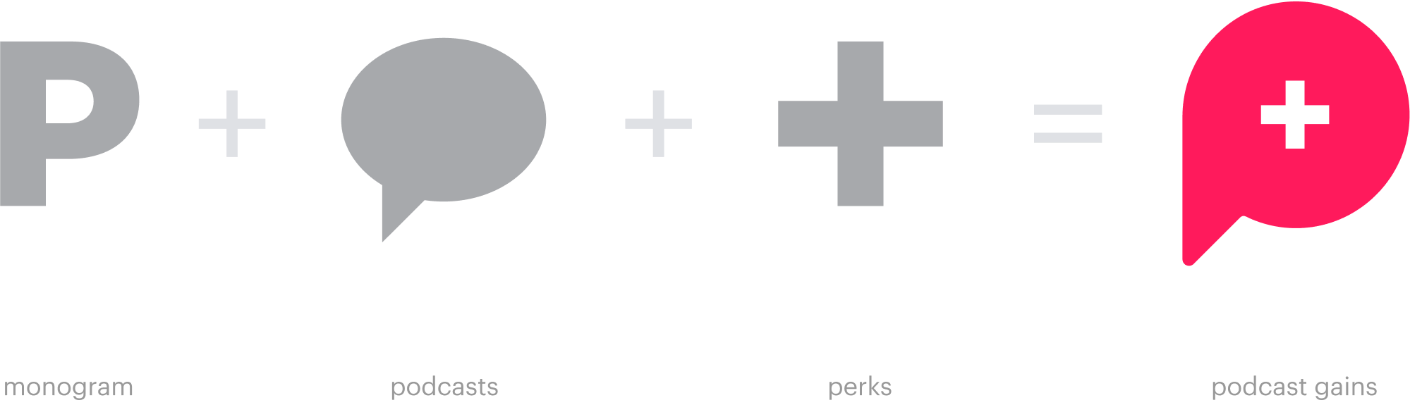
Logo shape serves as a container for content, creating clear brand attribution even when the full logo isn’t present.

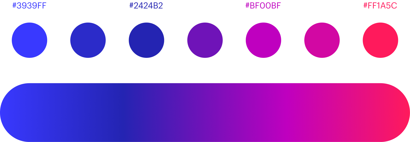
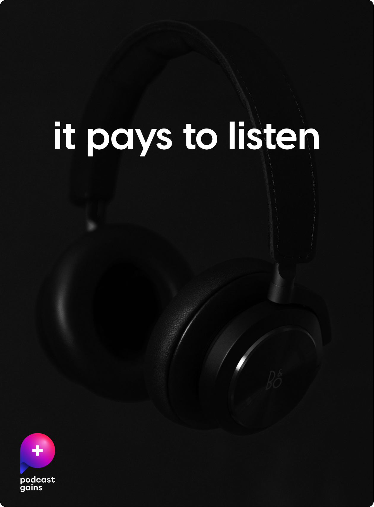
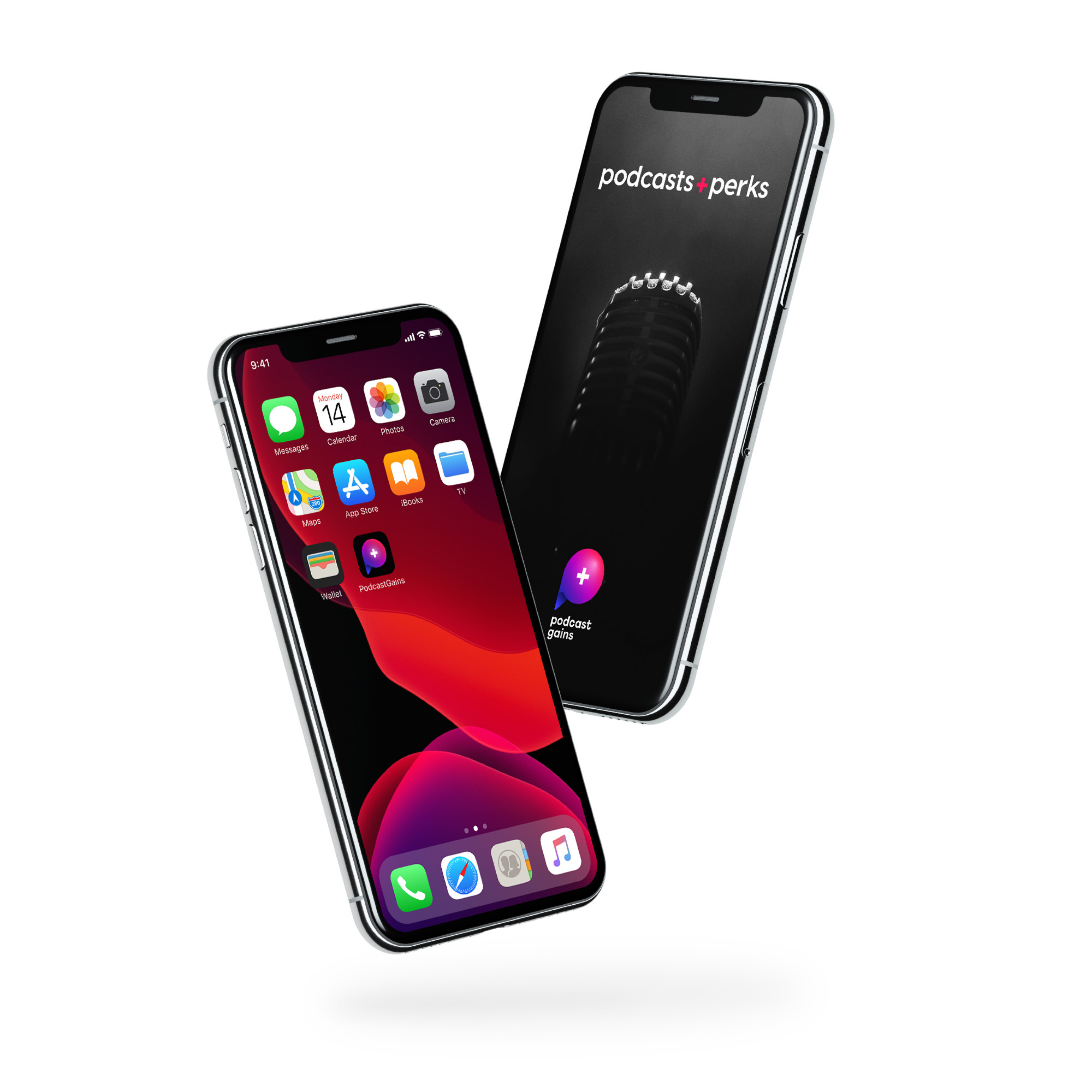
I created a vibrant color system that feels dynamic, versatile, and works amazingly well juxtaposed with dramatic black and white videos and photos.
The color palette uses a gradient instead of single colors, making it more fluid and flexible in expressing the mood and tone of voice.
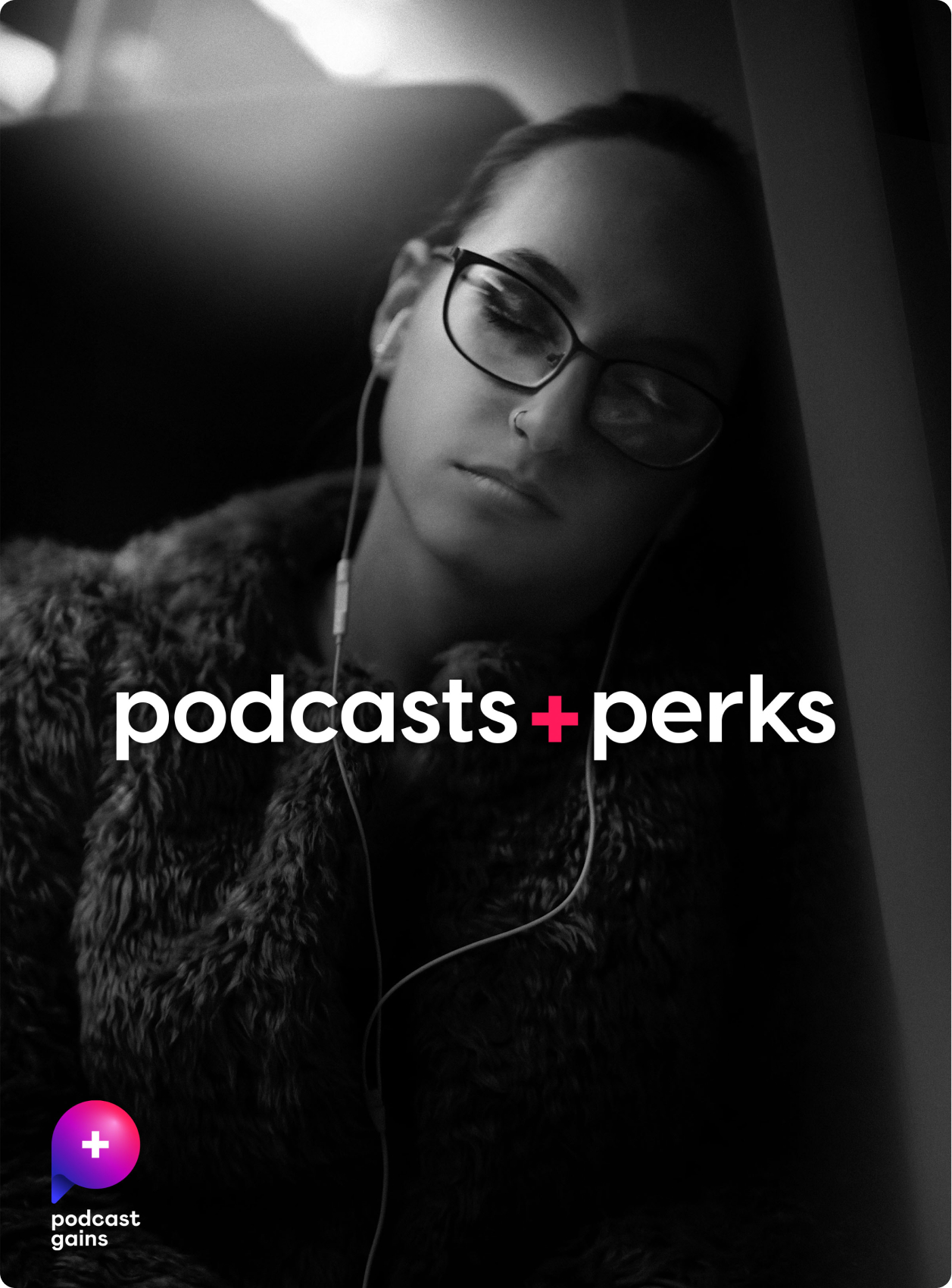
Typography is clean, informational, and allows for the visual content to take over.
Copywriting is simple, clever, and to the point, without sounding pretentious.