THE WHIZARD OF CLEAN
VISUAL, UI, UX DESIGN / CREATIVE & ART DIRECTION
The rapidly aging population (Japan has the world’s oldest population) led to the dramatic shrinking of the workforce as more adults retire and fewer children are born to eventually replace them. With the increased life expectancy the rest of the world (Germany, China, South Korea, Italy...) will ultimately face the same daunting demographic shift.
The problem is twofold:
Businesses experience a labor shortage and existing industry professionals are older people facing tasks that are both time consuming and physically demanding.
We were approached by SoftBank Robotics to conceptualize, design, and build a robot that could tackle these issues by being:
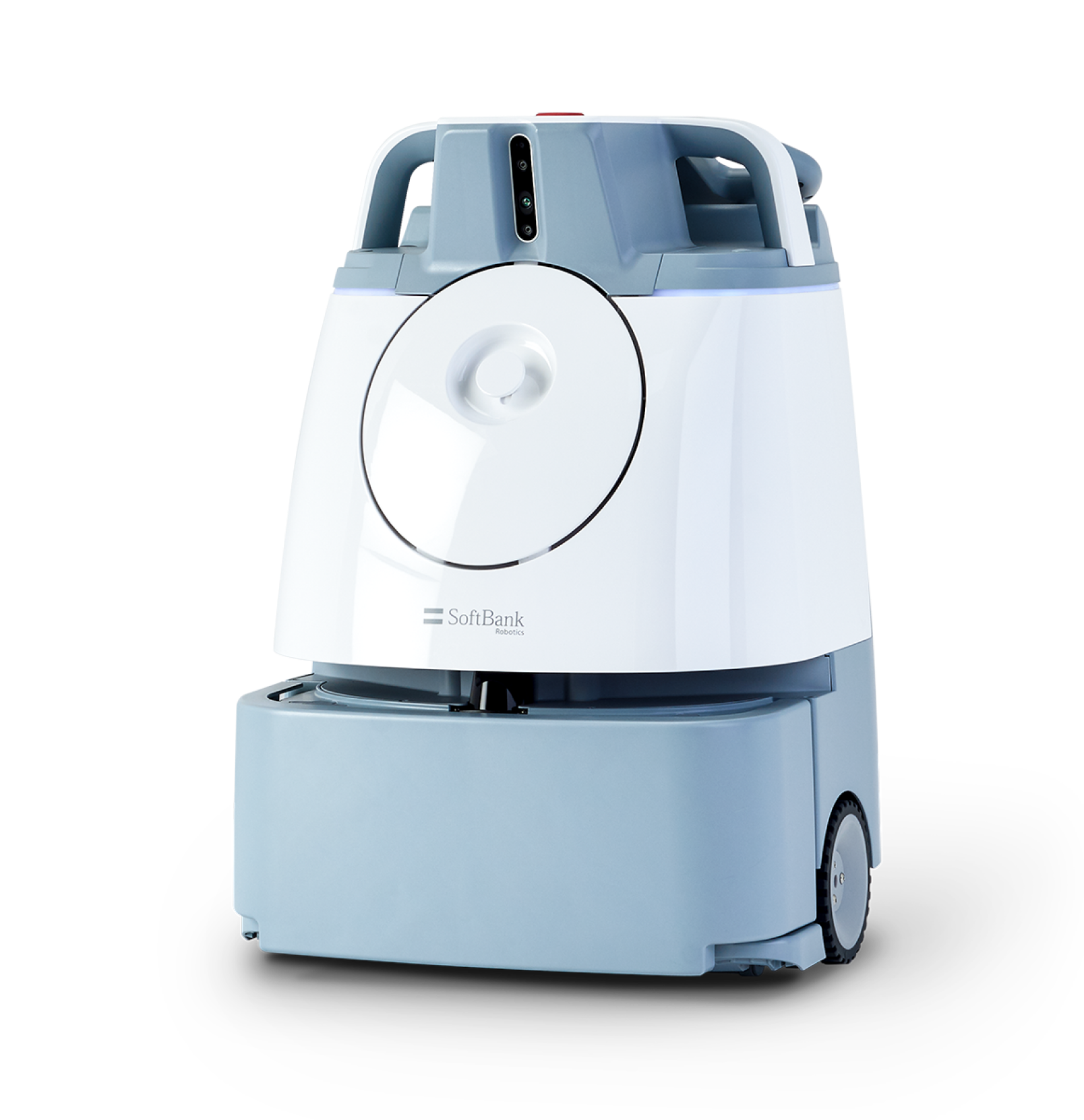
What ensued was a project collaboration across three countries with software engineering and UX design and development in the USA, manufacturing and mechanical design in China, and product ownership in Japan. We conducted UX research and testing across all three countries.
Whiz needs to work for all markets but initially, it HAD to work in Japan to expand the production to the rest of the world. So, no pressure there...
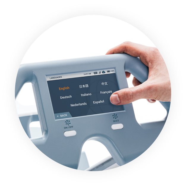
Initially launched in Japan, Whiz is now selling worldwide (USA, Europe, Asia) and is currently supporting seven languages with complete UI localization and translations.

(Not to brag, but Whiz has already won the ISSA Innovation Award, the Good Design Award, and the Edison Award)
The culture in a Japanese work environment differs greatly from that of an American workplace.
While Americans generally have to be self-motivated, and their individualism is encouraged, Japanese employees embrace a group mentality. Japanese workers must get their superiors' approval whenever they make a decision and it is expected that they immediately report any problems to their bosses before trying to take care of anything on their own.
Understanding this proved to be crucial in designing a product that would allow Japanese workers to address any potential issues quickly and easily, in a way that would not require a lengthy pause or another person’s intervention.

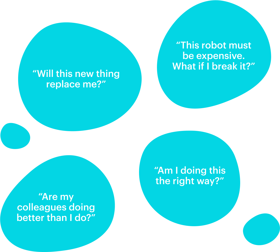
Robot is a tool.
Robots will take over.
Robots will take our jobs away.
Resistance.

Robot is a friend/colleague.
Peaceful coexistence with robots.
Robots will help us.
Acceptance.
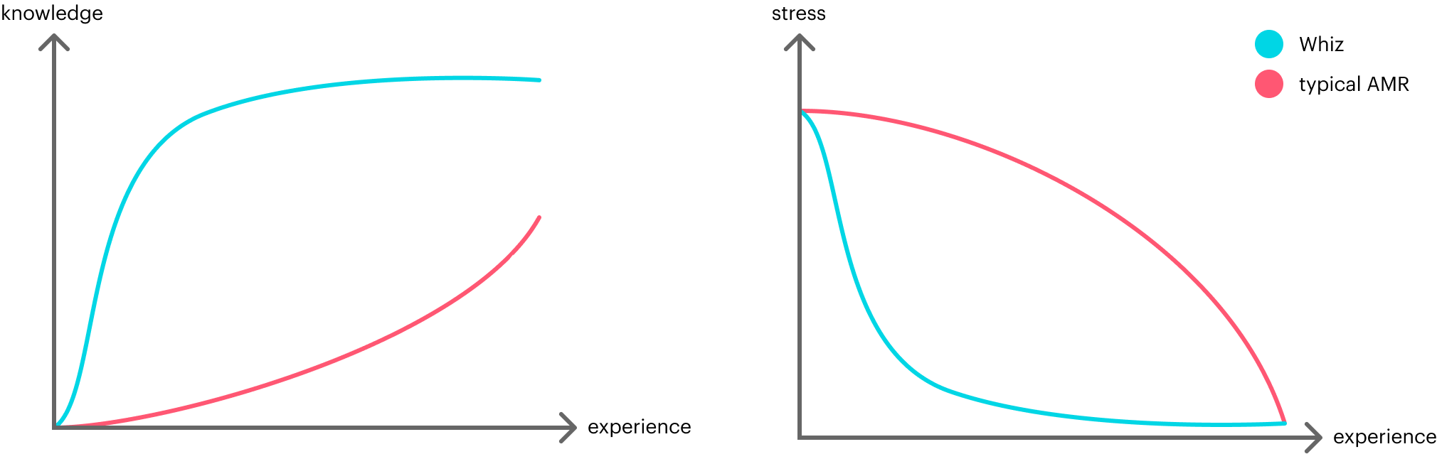
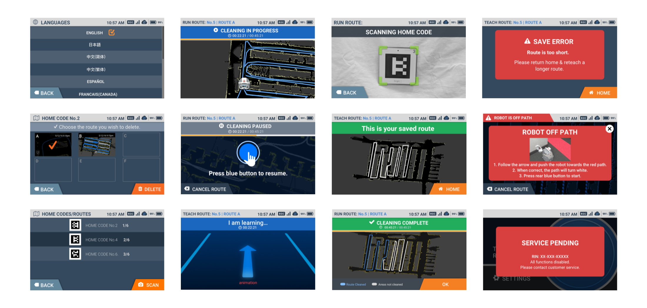
With Whiz UI we have always aimed for zero cognitive load and minimal amount of stress possible.
The mental effort used had to be the same or, ideally, less than before users were introduced to Whiz. Nothing to decipher and interpret, no vague icons and language, no complicated user flows.
TYPICALLY, USERS WITH NO PRIOR EXPERIENCE LEARN HOW TO USE WHIZ USER INTERFACE IN 15 MINUTES OR LESS.
Every design decision was measured so it doesn’t increase friction and frustration as we were aware these are the factors that heavily impact user adoption.
“It’s so simple to use - everybody understood it right away. There were no concerns once they were shown how to operate the Whiz.”
David McLoughlin
General Manager
Hilton Garden Inn

While working on Whiz user experience design we tried to anticipate, find, and remove all barriers that prevent efficient interaction of the user with a robot. Then we would test and interview users to either confirm or improve our decisions.
The product we designed should be easy to teach, easy to learn, and easy to use.
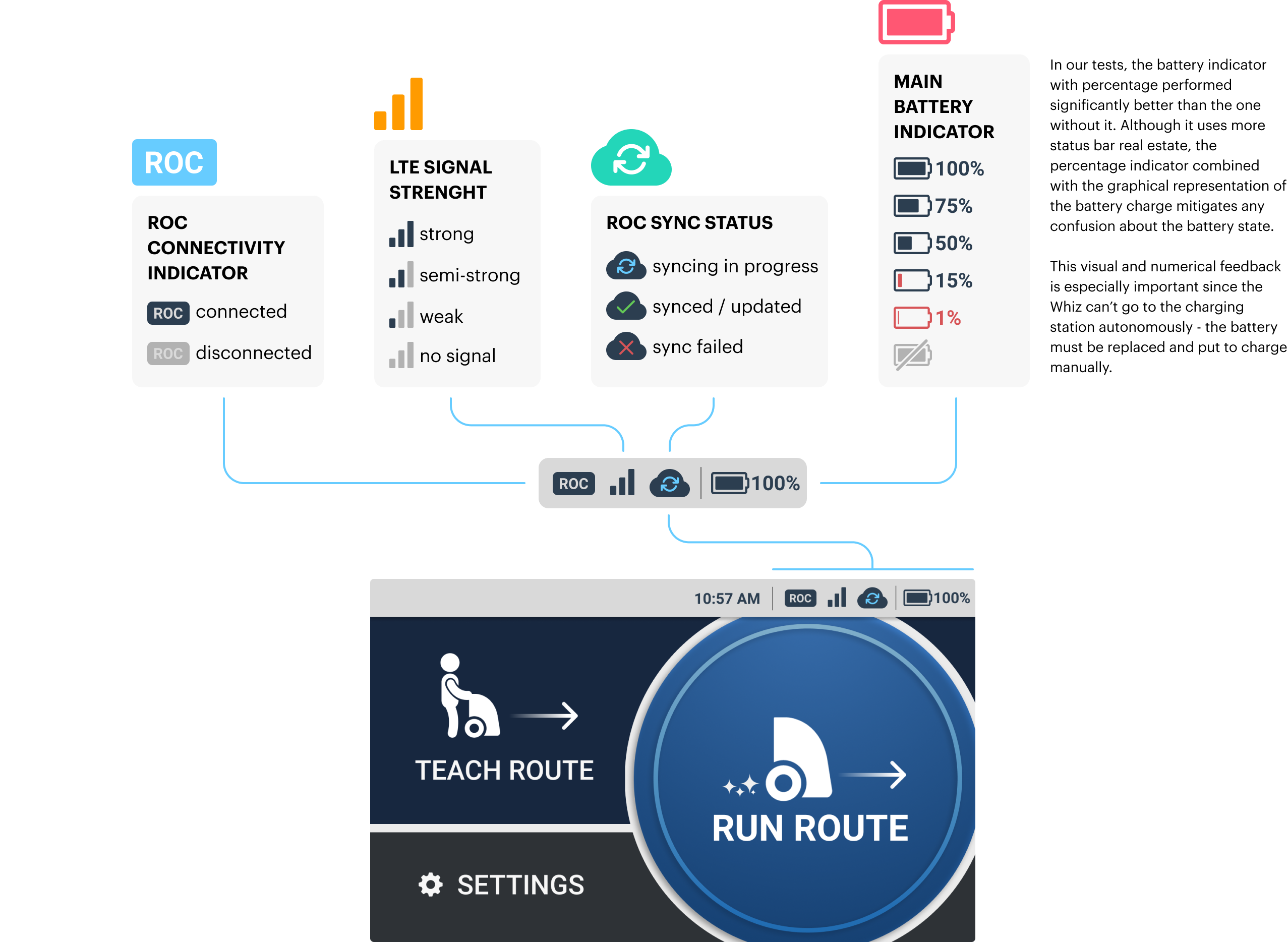
The interface is designed in a way that always keeps users informed about what is going on, through immediate feedback.
Because we consulted with them, we use words and phrases familiar to the users, rather than sterile language or jargon.
There’s always an exit to leave the unwanted state. Users can undo most actions, and if not, there’s always a message that clearly states that.
Users should not have to wonder if different words, situations, or actions mean the same thing.
We always show the relevant information so that the user should not have to remember information from one part of the interface to another.
We did a lot of user testing in order to design a product which prevents problems from occurring in the first place.
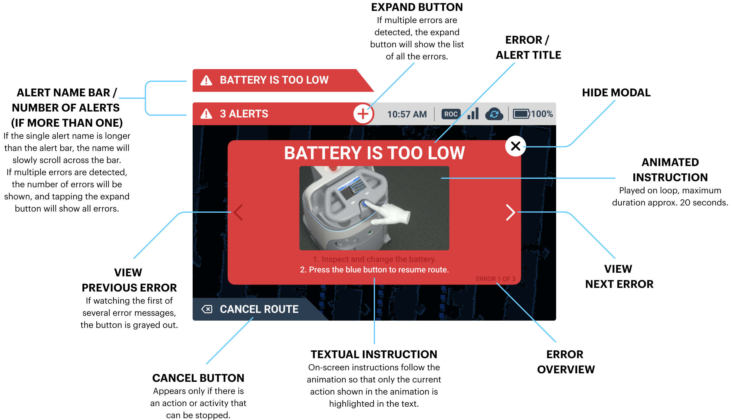
Errors do happen, so we express error messages in plain language to precisely indicate the problem, and immediately suggest a solution.

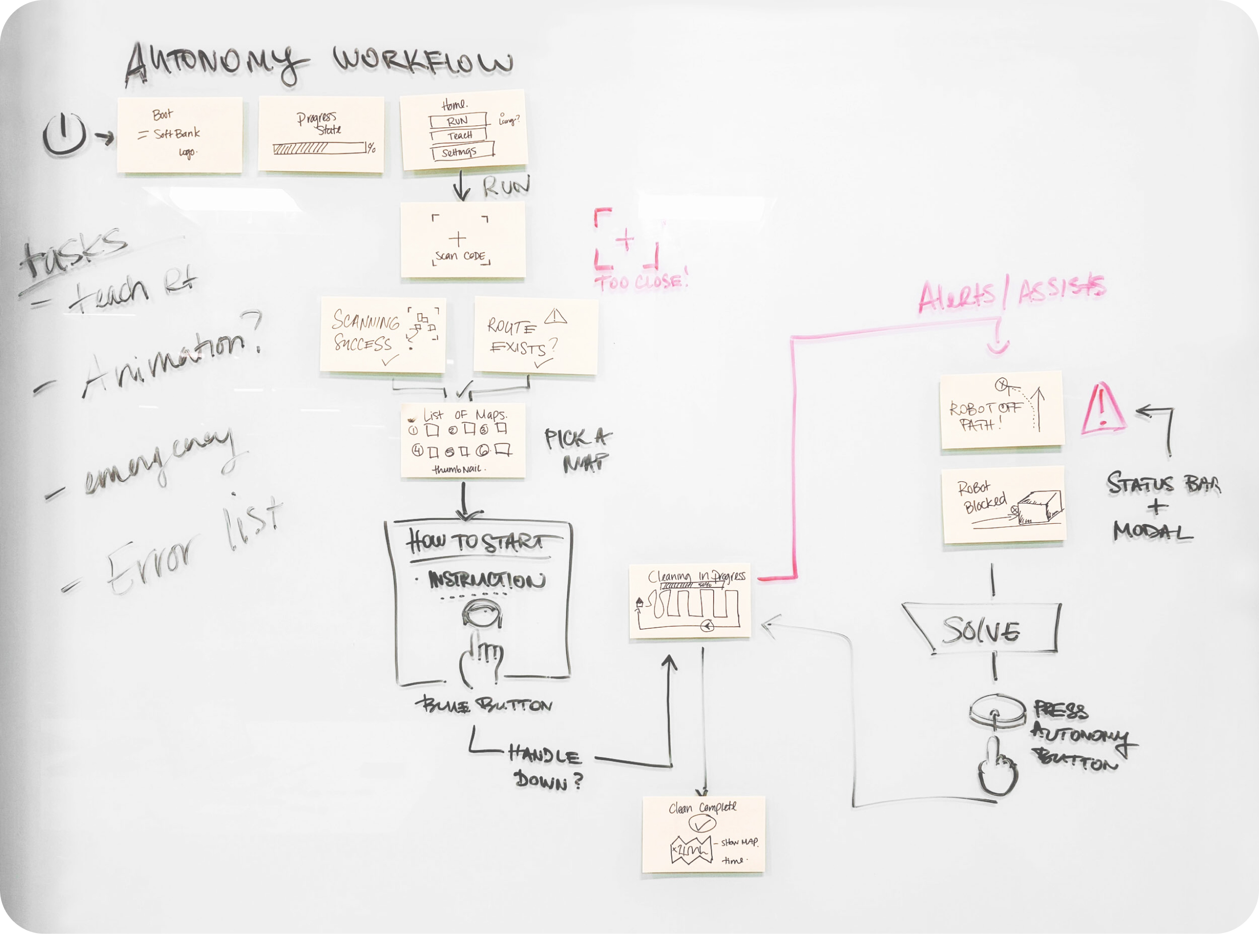
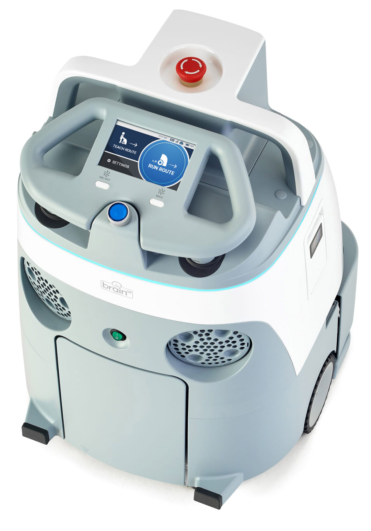
Start teaching the route by scanning the home code and pick a bank you will save the route to.
Scanning the home code procedure is simple, just position the robot in front of a home code marker.
After you have run the route manually the robot saved it, and it will start the autonomous run when you push the blue start button.
In case anything goes wrong, just press the red emergency stop button and the prompt on the screen will explain the next steps.
Intelligent lighting feedback for communication with the user and the environment.
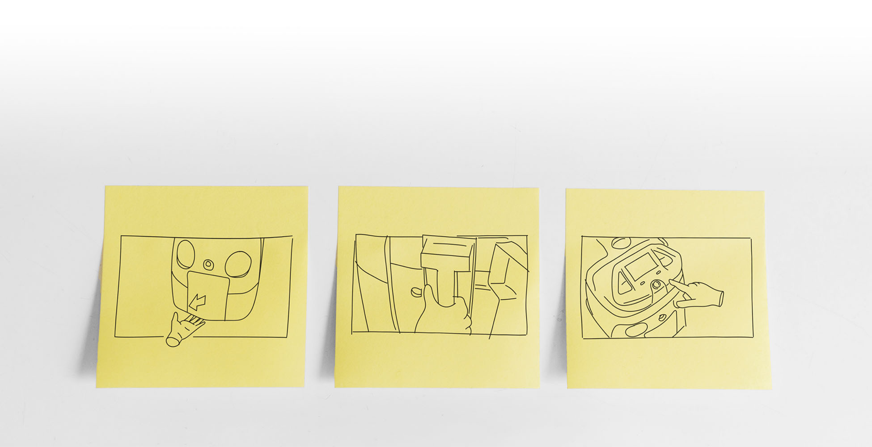
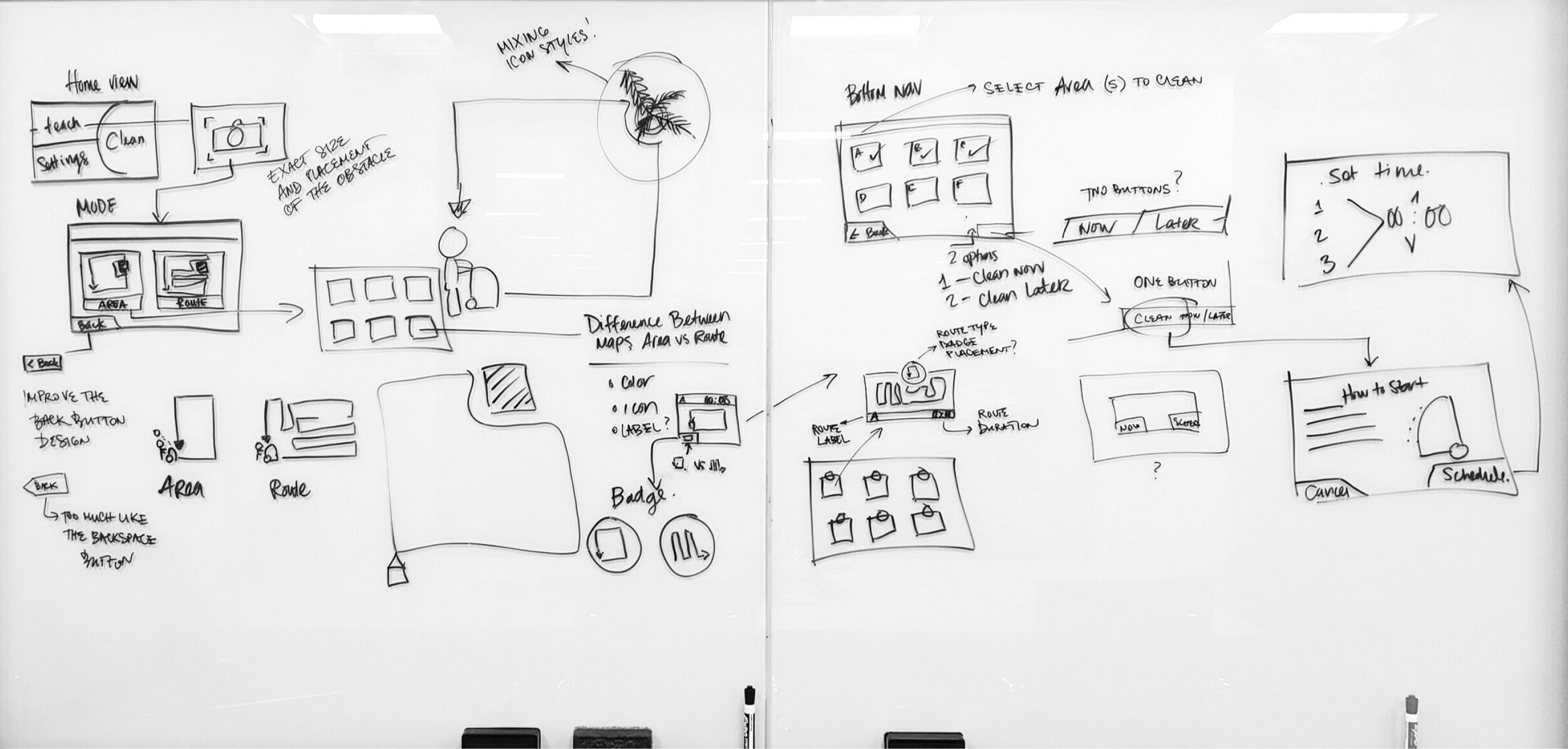
A series of quick sketches served as a storyboard for creating instructional animations
In my opinion, error/assist messaging was a crucial part of this particular user interface. There are many reasons why the person interacting with the robot might be stressed out even if everything is going okay.
You DO NOT want to add more stress by introducing the blunt error message that will paralyze the user. On the contrary, the message should immediately offer help - “Don’t worry, we got your back, we are in this together. Here’s what you should do.”
(user is informed that there is an error state but the instructions, although well written, proved to be inadequate and often confusing)
(much better understanding but illustrations required too much screen space and too many steps depicted to be effective)
(almost 100% understanding of the actions needed to mitigate the error)
At one point we realized that the animations were almost too interesting - users were watching every animation until the end (AND often for several times), so we decided to make them shorter and more concise.
The same amount of information, less time wasted.
Useful.
The keyword I kept coming back to when I was thinking of the Whiz user interface, and I used it to measure every decision we made.
“Is this feature useful, or is it just a fancy add-on? Will this change make the interface more or less useful for the person using it? Will this contribute to the quality of the user experience, or am I designing this just to satisfy my artistic ego?”
Those were the important questions that led to some difficult but mature product design decisions.
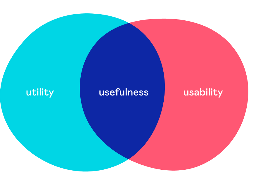
But what does being useful mean for an user interface?
I think that the usefulness of the user interface is defined by the two quality attributes - utility and usability.
The utility provides users with the features they need. Usability is how easy those features are to use. Ideally, you should strive for both in order to achieve a great user experience.
If you focus too much on the eye candy and ignore or fail to deliver on these two fundamental qualities, you are creating a useless product. It might be beautiful on the surface, but if it doesn’t help the user - it is actually ugly.
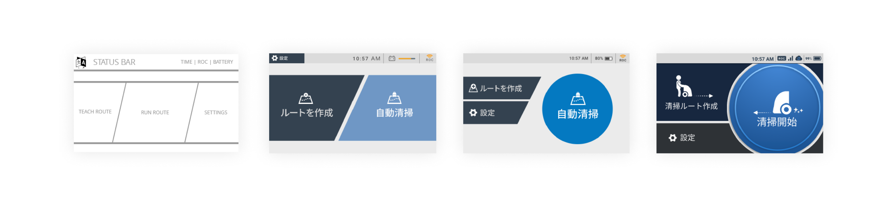
Home screen UI design evolution - Phase I
NO, AND THAT’S BY DESIGN.
IN THIS PHASE we weren’t designing the user interface, we were designing the product. a product had to address a very clear list of fundamental user needs - utility, usability, and reliability.

Here’s the thing with beauty. It can be blinding.
It has been shown that users tend to perceive attractive products as more usable. People instinctively believe that things that look better also work better - even if they aren’t more effective or efficient.
In the product design phase this presents a huge danger and here’s why.
Users are more tolerant of usability issues if they find an interface visually appealing. This aesthetic vs. usability correlation can mask UI problems and can prevent issue discovery during usability testing because it often influences user comments. And that is the very thing we wanted to avoid. We were creating a product from scratch, so we needed unbiased insights.
Make it useful first. Then make it beautiful.
And find the right balance between the form and the function.
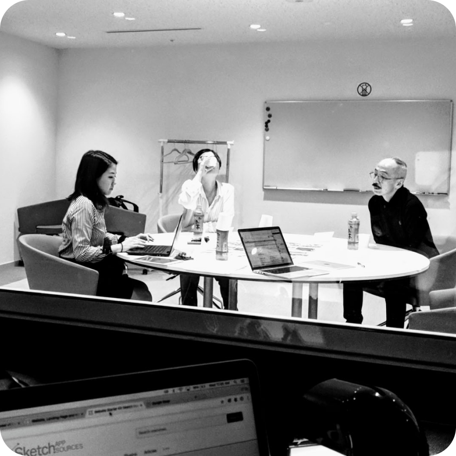
One of dozens of user interviews conducted in Japan
It is always humbling to find out how the real-world use of your product and its interaction with users in the field can reveal the flaws in something that you might have foolishly considered complete.
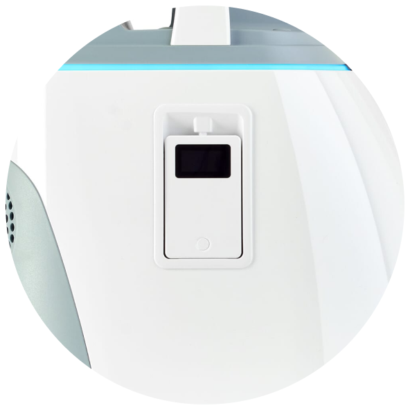
For security reasons, many office buildings in Japan prohibit janitors from carrying cell phones. However, Whiz needs to be able to communicate with the janitor in case of an error, or if it encounters an obstacle it cannot bypass on its own during the autonomous work. Whiz does that by sending a text message to the janitor’s cell phone. Which the janitor isn’t allowed to carry. Hmmm.
It is interesting (and mildly embarrassing) that we have spent quite some time trying to solve this through the OS software and UI only to realize that the hardware solution was the easiest and the most elegant. To address this problem we designed Whiz with a built-in pager that the janitor takes with him or her at the beginning of the shift. The provided pager enables the user to focus on other tasks, to work remotely, and not to babysit the robot.
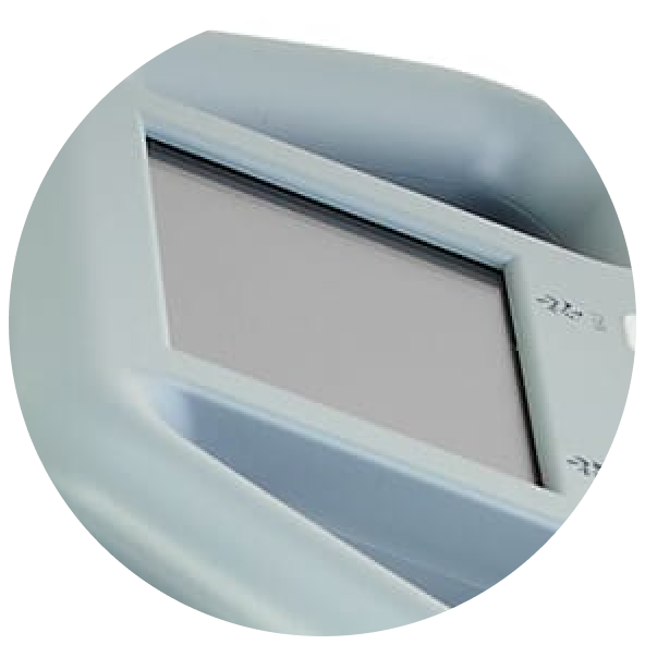
“What do you mean - they struggle using the buttons?”
Users had significant issues pressing the bottom tab bar buttons even though the button size and target area were designed according to the standards for the touch screens. After further research we realized that the culprit wasn’t the UI design but rather the design of the hardware - the touch screen was inset 3-4mm below the controller surface level, making tapping the buttons difficult as the finger would rub against the surrounding edges, thus decreasing the pressure applied to the screen.
A seemingly small thing that caused major frustration for the users. Also, a thing you’d never notice until you leave your design software bubble - on your screen, everything always seems fine.
We enlarged the button height (duh...) by 10% and that completely solved the issue. A miracle!

Base
Background, text, message bar

Back / Pause state
Buttons, secondary message bar

Success / Action complete
Message bar

Next action
Buttons, selected states

Navigation / Autonomy
Message bar, map path

Error
Error status bar, error / assist / alert modals